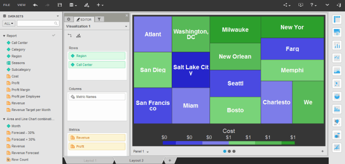
You can click on the name of a dashboard to run it. By default, dashboards are displayed as fully interactive dashboards in dossier, allowing you to sort and rearrange data in an interactive grid, perform manipulations on the data to display only the information you are interested in, display visual representations of the data in the dashboard to make the data easier to interpret, and so on. You can also maximize the amount of space available for data display by viewing dashboards in Presentation Mode.

Note: If one or more of the data sources for the dashboard is an Intelligent Cube, and if the Intelligent Cube is not available in Intelligence Server's memory, an error message may be displayed. To publish the Intelligent Cube, in the error message, click Republish. The Republish Dataset page opens.
Related concepts
Understanding the parts of a document
Saving and exporting a dashboard
Related tasks
Recovering dossiers documents and reports
About Report Services documents
Viewing a dashboard in Presentation Mode
Analyzing data using visualizations in a dashboard
Analyzing data in an ESRI Map visualization
Analyzing data in a Google Map visualization
Analyzing data in a Heat Map visualization
Analyzing data in a Network visualization
Analyzing data in a Graph visualization
Analyzing data in a Grid visualization
Filtering or highlighting the data in a visualization based on selections in another visualization
 Copyright Numerify, Inc. All Rights Reserved ©2021