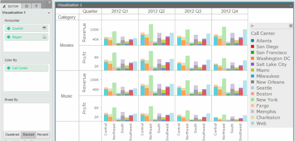
A Graph visualization allows you to view your data in a graphical layout, such as a bar graph or scatter graph. You can select from a variety of graph styles to display the data. In the example below, the vertical bar graph style was chosen.

For example images of the graph styles available for Graph visualizations.
If a graph displays multiple attributes either vertically or horizontally, you can use an attribute to separate (or slice) your data into separate rows or columns of graphs, or you can display all the attributes in a single set of graphs. For example, a bar graph contains revenue data for multiple years and regions. You can display a bar graph for each year and region combination. You can instead slice the data by year to display columns of bar graphs, with each column containing a set of bar graphs for a single year’s revenue data. For a more detailed description, including examples and steps to determine whether to display rows and columns of graphs or to display a single set of graphs.
Follow the steps in the table below to analyze data in a graph. You can also drill and filter a graph:
You must have the Web Edit Dashboard and Web Run Dashboard privileges.
| To... | Do This... |
|---|---|
|
Expand or collapse the legend |
Click the arrow icon at the top of the legend. |
|
Move the legend |
By default, the legend is displayed on the right side of the graph. To move the legend, click and drag it to its new location, so that a blue indicator line is displayed in the new position. |
|
Display additional information about a graph element |
Hover your cursor over the graph element to display a tooltip with the information. |
|
Display additional information about a trend line |
Hover your cursor over the trend line to display a tooltip with the information. Trend line information includes the metric the trend line is based on, the mathematical function used to display it, and its coefficient of determination. |
|
Swap the objects in the horizontal and vertical areas |
In the Editor panel, click
the Swap icon |
| Sort data in the grid based on a single object |
In the Editor panel, right-click the attribute or metric to sort, then do one of the following: To sort the values in the graph in ascending order (from A to Z), select Sort Ascending. To sort values in the graph in descending order (from Z to A), select Sort Descending. |
|
Remove a sort from the graph |
In the Editor panel, right-click an object and select Clear Sort. You do not have to select the object that the graph is sorted on. |
|
Rename an object in the graph
|
In the Editor panel, right-click the name of the object to rename, then select Rename. A field displaying the name of the object is displayed. Type a new name for the object in the field, then press ENTER. The object is renamed. |
Drilling lets you view data at levels other than that displayed in the graph. You can drill down, up, or across attributes and some metrics displayed in a graph.
For example, if your graph displays categories, you can drill from a specific category to that category’s subcategories. If you drill down from the Electronics category, only the subcategories within Electronics, such as Audio Equipment and Cameras, are displayed.
You can drill on a graph in the following ways:
| Result | Available Graph Types | Example |
|
Display data for selected graph items, breaking the data by a selected attribute |
|
A scatter graph contains profit data across several regions. If you select the bubbles for the Northeast and Central regions, and then drill to Call Center, profit data for each call center in the Northeast and Central regions is displayed. |
|
Display data for selected graph items in a separate graph column for each attribute element on the horizontal axis |
|
A vertical bar graph contains profit margin data across several years. If you select the bars for 2011 and 2012, and then drill to Category, profit margin data for each Category is displayed, and a graph is displayed in a separate column for 2011 and 2012. |
|
Display data for selected graph items in a separate graph row for each attribute element on the vertical axis |
|
A horizontal bar graph contains profit margin data across several years. If you select the bars for 2011 and 2012, and then drill to Category, profit margin data for each Category is displayed, and a graph is displayed in a separate row for 2011 and 2012. |
Related concepts
Related tasks
Analyzing data using visualizations in a dashboard
Analyzing data in an ESRI Map visualization
Analyzing data in a Google Map visualization
Analyzing data in a Heat Map visualization
Analyzing data in a Network visualization
Analyzing data in a Grid visualization
Filtering or highlighting the data in a visualization based on selections in another visualization
 Copyright Numerify, Inc. All Rights Reserved ©2021