Drag objects from the Datasets panel to the Editor panel to add the corresponding data to the visualization. You can also drag objects from the Datasets panel directly onto the visualization.
To view data requirements for a graph style, hover your cursor over the visualization icon in the Visualization Gallery.
To display a vertical combination graph, place at least one metric in the Vertical area and at least one attribute in the Horizontal area.
or
To display a horizontal combination graph, place at least one attribute in the Vertical area and at least one metric in the Horizontal area.
There are several ways to color graph items, based on attributes or metrics.
To color the graph items based on an attribute, place at least one attribute in the Color By area. Each value in the attribute appears in a different color.
Display the sales data for each employee using a different bar color. If you add more than one attribute to the Color By area, each combination of the attribute values appears in a different color.
or
To color graph items based on the value of a metric, place one metric in the Color By area. The graph items in the visualization are automatically shaded based on the value of the metric.
You can automatically color the areas in a graph based on the value of the Profit metric. Display larger profit values with dark colors and smaller profit values with light colors.
or
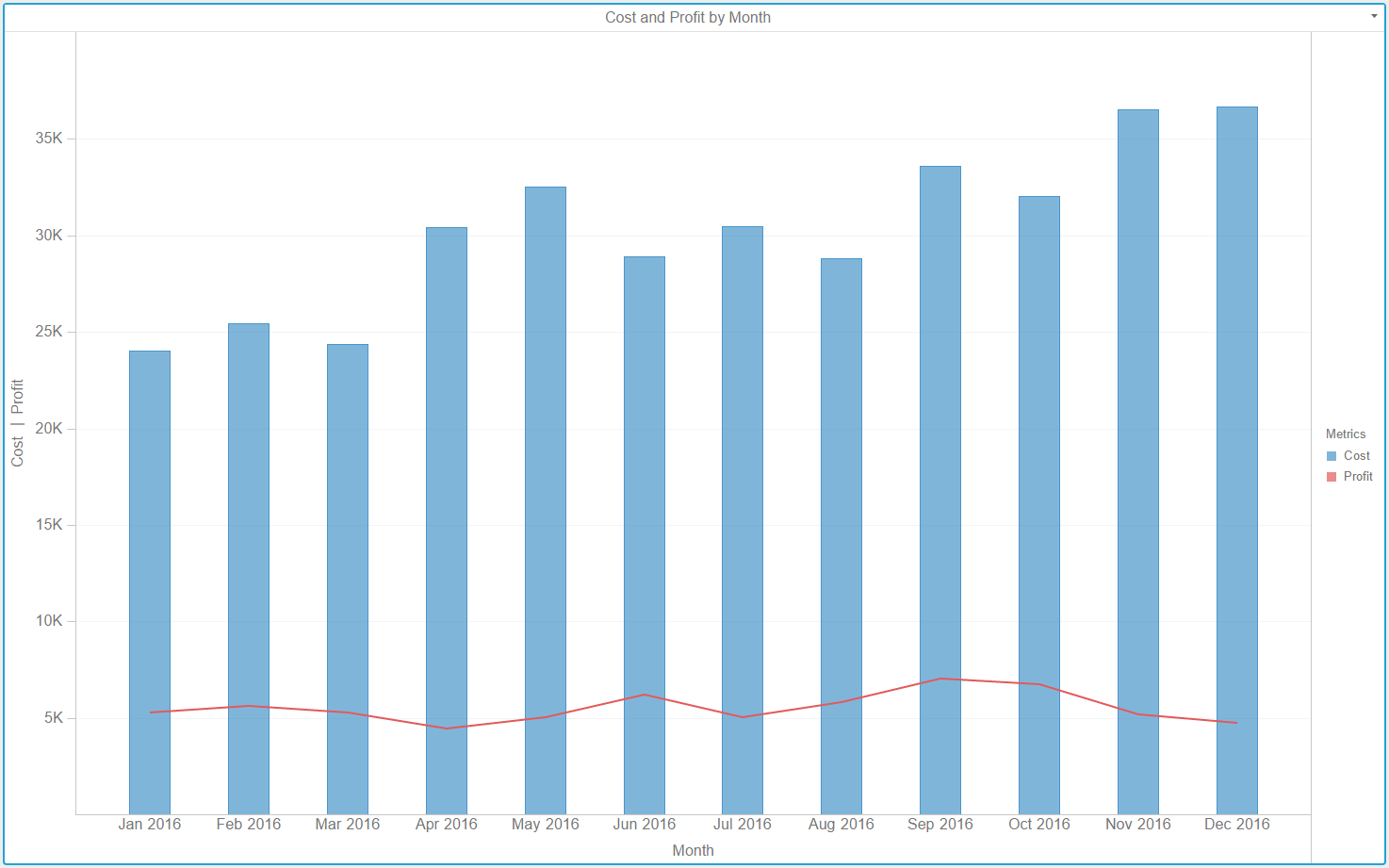
To color graph items based on the metric that each item represents, place the Metric Names attribute in the Color By area. Each metric in the visualization appears with a different color.
Display the Revenue, Cost, and Profit metrics using a different color for each metric.
To size graph items based on the value of a metric, place one metric in the Size By area. Graph items with large metric values appear larger in size. Graph items with small metric values appear smaller in size.
In a line graph, lines representing larger metric values appear thicker than lines representing smaller metric values.
To display a separate graph item for each element in an attribute, place at least one attribute in the Break By area. If you add more than one attribute to the Break By area, a graph element appears for each combination of the attribute elements.
Display the revenue data for each Region as a separate line graph, or display a bar for each year of data.
Select Absolute, Stacked, or Percent to select a specific graph subtype to display the visualization. If you select Stacked or Percent, metrics appear in the order shown in the Vertical and Horizontal areas. If you select Absolute, metrics appear in the following priority order by shape: areas, bars, circles or squares, and lines or ticks. If you select Absolute and two shapes have the same display priority (that is, circles and squares), the metrics appear in the order in which they are shown in the Vertical and Horizontal areas.
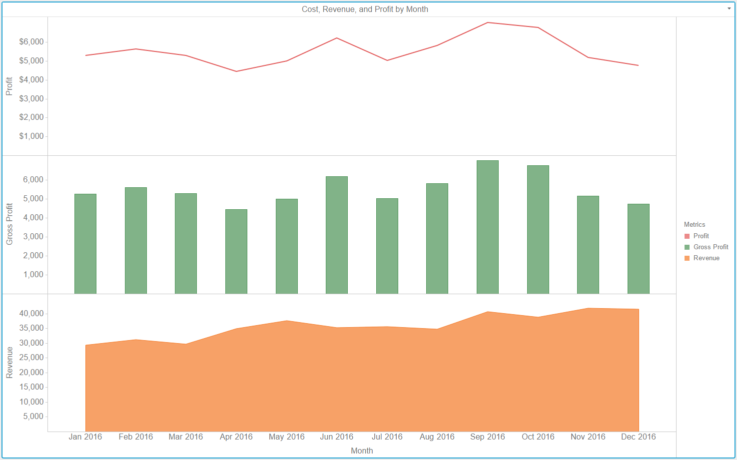
You can slice data into rows and columns of separate graphs, based on attributes. If you slice the data into both rows and columns, a table of graphs appears, with a graph for each combination of the attribute elements.
Slice your data into rows of graphs. Drag at least one attribute to the top of the Vertical area. Each graph appears in a separate row, one for each element in the attribute.
or
Slice your data into columns of graphs. Drag at least one attribute to the top of the Horizontal area. Each graph appears in a separate column, one for each element in the attribute.