You can create area, bar, or line graph visualizations. These graphs require at least one metric and at least one attribute.
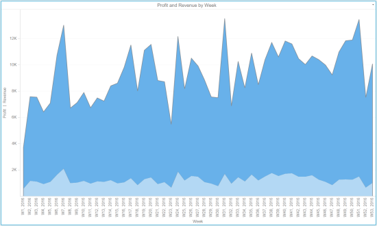
An area graph displays your data as a vertical or horizontal area graph. The area represents metric values for each element of an attribute. Below is an example area graph.
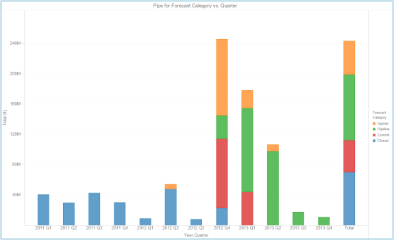
A bar graph displays your data as a vertical or horizontal bar graph. The bars represent metric values for each element of an attribute. You can also stack graphs and color them by an attribute to save space. Below is an example bar graph.
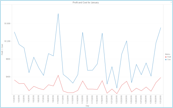
A line graph displays your data as a vertical or horizontal line graph. The lines represent metric values for each element of an attribute. Below is an example line graph.
Steps:
In the Visualization Gallery, click Area Chart ![]() to create an area chart.
to create an area chart.
or
Click Bar Chart![]() to create a bar chart.
to create a bar chart.
or
Click Line Chart ![]() to create a line chart.
to create a line chart.
Drag objects from the Datasets panel to the Editor panel to add the corresponding data to the visualization. You can also drag objects from the Datasets panel directly onto the visualization.
Note: To view data requirements for a graph style, hover your cursor over the visualization icon in the Visualization Gallery.
To display a vertical area, bar, or line graph, place at least one metric in the Vertical area and at least one attribute in the Horizontal area.
or
To display a horizontal area, bar, or line graph, place at least one attribute in the Vertical area and at least one metric in the Horizontal area.
To size graph items based on the value of a metric, place one metric in the Size By area. Graph items with large metric values appear larger in size. Graph items with small metric values appear smaller in size.
Note: In a line graph, lines representing larger metric values appear thicker than lines representing smaller metric values.
The Size By option is not available for Area Charts.
To display additional metrics when you hover over a graph element, place metrics in the Tooltip area.
To break the graph based on the value of a metric, place one metric in the Break By area.
Select Absolute, Stacked, or Percent to select a specific graph subtype to display the visualization.
Related Topics
Introduction to Graph visualizations
Adding and rearranging data in a graph visualization
Splitting a graph in to separate rows and columns
Displaying a reference line a graph visualization
Formatting a Reference Line in a graph visualization
Displaying a Trend Line in a graph visualization
Abbreviating the X and Y axes in a graph visualization
Defining colors for displaying attributes in a graph visualization
 Copyright Numerify, Inc. All Rights Reserved ©2021