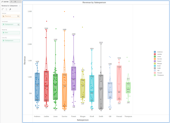
A box plot visualization allows you to examine the distribution of data. One box plot appears for each attribute element. Each box plot displays the minimum, first quartile, median, third quartile, and maximum values. In addition, you can choose to display the mean and standard deviation as dashed lines. Outliers appear as points in the visualization. You can adjust the spacing between points (that is, jitter) to avoid overlap. A box plot must include at least one metric and at least one attribute.
Related Topics
Swapping objects in a Grid, Graph, Waterfall Chart, or Box Plot
Drilling in and out of a Box Plot
Selecting data in a Histogram or Waterfall Chart
Zooming and panning on a Histogram, Waterfall Chart, or Box Plot
 Copyright Numerify, Inc. All Rights Reserved ©2021