You are here: Dossier Authoring > Building your first dossier > Creating a Heat Map Visualization

Creating a Heat Map Visualization

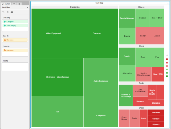
A heat map visualization is ideal for identifying performance patterns. Attention is drawn instantly to color-coded results, and it is easy to understand the impact of multiple business performance indicators at a glance. A heat map visualization is a combination of nested, colored rectangles, each representing an attribute value, or element. You can add a heat map to a dossier to quickly grasp the state and impact of a large number of variables at one time.

Note: A heat map visualization requires one attribute and one metric.

To create a Heat Map Visualization on a dossier using your imported data:

  1. Open a blank dossier.
  2. The Visualization Gallery should appear by default. If you do not see it, click Visualizations in the left pane.
  3. In the Visualization Gallery, click Heat Map .
    You can change the visualization type by selecting the different options in the Visualization Gallery (for example, Grid, Heat Map, Bar Chart, etc.). Hover over each option to view its mandatory data requirements.
  4. Drag an attribute from the Datasets panel to Grouping area of the Editor panel. A rectangle for each attribute in the Grouping area appears in the heat map. If necessary, drag additional attributes to the Grouping area to split the heat map into multiple groupings.
  5. Drag a metric that determines the size of each rectangle from the Datasets panel to the Size By area. The size of a rectangle is based on the value of the metric.
    The metric also appears in the Color By area and is used to color the rectangles based on the value of the metric.
  6. Right-click an attribute or metric in the Editor Panel and select Remove to remove the corresponding data from the visualization.
  7. If necessary, click Remove Data to remove all data from the visualization.

Related Topics

Creating a dossier

Formatting a Heat Map Visualization

About visualizations

Introduction to using multiple datasets in a visualization

Examining the underlying data in a visualization

How to Apply Dynamic Text Fields to a Visualization

Apply Images to Visualizations

Apply Web Content to Visualizations

Introduction to Metrics

Introduction to Derived Metrics

How to Create a Derived Attribute

Introduction to Groups

Copyright Numerify, Inc. All Rights Reserved ©2021