Open topic with navigation
Creating a dashboard
A dashboard is an interactive display that you can create to showcase
and explore business data. You can add simple visual representations of
the data (called visualizations) to the dashboard to make the data easier
to interpret, perform manipulations on the data to customize which information
to display, organize data into multiple sheets and pages to provide a
logical flow to your dashboard, and so on. You can quickly and easily
create a polished dashboard without requiring a lot of design time using
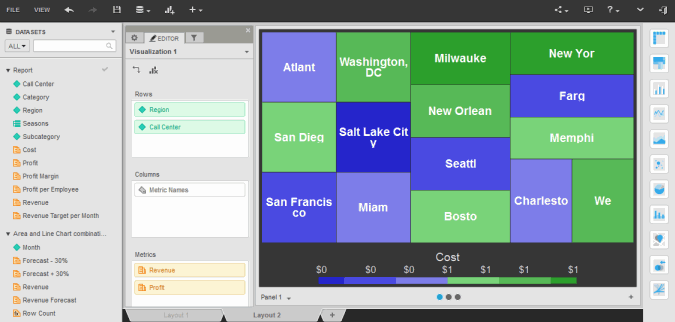
visualizations and pre-defined, presentation-quality formatting. An example
of a dashboard is shown below:

You can add data to a dashboard in the following ways:
- By
importing the data from an outside data source, such as a file.
- Based
on an existing report.
- Based
on an existing Intelligent Cube, including imported data.
- Based
on a report that you create within the dashboard.
- Based
on data in the current project.
Dashboards open by default in dossier mode, where you can easily
drag and drop attributes and metrics to display data, create filters,
group data, and more. You can also maximize the amount of space available
for data display by viewing dashboards in Presentation
Mode. You
can share a dashboard through email, by
linking to the dashboard, or by embedding the dashboard in a web page.
Prerequisites
- You
must have document designer privileges.
- You
must have the Web Edit Dashboard, Web Create Dashboard, and Web Run
Dashboard privileges.
- To
create a dashboard by importing data, first familiarize yourself with
the best practices information for importing data.
- To
create a dashboard from existing data, you must first create the report
or Intelligent Cube to use to create the dashboard.
Steps to create a dashboard
- On the home page or any folder
page, click Create, and then select New Dashboard. Your dashboard is created and
displayed, containing a single blank visualization.
- If the
Getting Started page is displayed, click Get
Started to open the dashboard. The Getting Started page
contains dashboard sample and tutorial videos.
- If
a message displays about accessing Getting Started and Quick
Tips, click OK to
close the message.
- To
skip the Getting Started page the next time that you open
a dashboard, on the Getting Started page, select the Don’t Show This Again check
box.
- To
display the Getting Started page once you are in dossier,
from the Help menu,
select Getting Started.
- If tips
are displayed to guide you through the process of creating a dashboard,
click Hide Quick Tips and
begin creating your dashboard. To display the tips again, from
the Help menu, select
Quick Tips.
- You can add data to the dashboard
in any of the following ways. You can combine multiple methods of
adding data.
- To import
data into the dashboard to use as a dataset, click the Add
Data icon
 , and select External
Data. Select the appropriate options to import, review,
clean, and publish your data, then click Create
Dashboard.
 - To add
data from an existing report or Intelligent Cube, click the Add Data icon
 , and select Existing
Dataset. The Select Dataset dialog box opens. Navigate
to and select the dataset to add. You can make multiple selections
at once by pressing CTRL as you select
each item. Click Select.
- To create
a new dataset within the dashboard, click the Add
Data icon
 , and select New
Report. The Report Editor opens. Select the appropriate
options to define your new dataset.
 - To add
data within the current project to the dashboard, click Browse All Objects in the Datasets
panel. The All
Objects panel is displayed.
- The selected data is added to
your dashboard as a dataset. (If you selected Browse All Objects,
the project's objects are displayed as dataset objects.) Datasets
provide the data in a dashboard; by adding multiple datasets to a
dashboard, you can use objects from multiple datasets to create visualizations,
analyze data, and so on.
Add
content to the dashboard
- You can add visualizations to
the dashboard. A visualization is a simple visual representation of
your data. For steps to add a specific type of visualization, see
the related links below:
- Creating
an ESRI Map visualization
- Creating
a Graph visualization
- Creating
a Google Map visualization
- Creating
a Grid visualization
- Creating
a Heat Map visualization
- Creating
a Network visualization
- After you create a visualization,
you can format it, to rename attributes or metrics, choose whether
to display a visualization’s title bar, whether to apply banding to
values in a grid, and so on.
- You can add text, images, and
Web content to the dashboard. For background information and steps
to perform a specific task, see the appropriate link below:
- Adding
text to a dashboard
Text can serve as a label for your data or provide background information,
a description, or instructions for the dashboard.
- Adding
images to a dashboard
- Adding
an HTML container to a dashboard
An HTML container displays the contents of a web page or content
formatted in HTML.
- You can create new attributes,
metrics, and groups of attribute elements based on existing objects.
For background information and steps to perform a specific task, see
the appropriate link below:
- Creating
a metric based on existing objects: Derived metrics
Derived metrics are metrics that you can create based on existing
metrics on the dashboard. A derived metric performs a calculation
on the fly with the data available on a dashboard, without re-executing
the dashboard against the data source.
- Creating
an attribute based on existing objects: Derived attributes
Derived attributes are attributes that you can create based on
existing dataset objects that are already included in the dashboard.
Once you create a derived attribute, it works the same as any
other attribute. For example, you can add it to a visualization.
- Grouping
attribute elements in a dashboard
You can replace multiple attribute elements with a single group
in a visualization. For example, you can group regions into areas
such as North, South, and Central. You can create a new group
by combining attribute elements with a calculation, such as sum
or average. Groups allow you to manipulate the display of your
data.
- You can organize your content
into multiple pages and sheets, as described below:
- Adding,
renaming, moving, and deleting sheets in a dashboard
Sheets allow you to create layers of data that are filtered in
different ways. Each sheet has a separate set of filters, allowing
you to create different filters for different sheets. Each sheet
is displayed on a separate tab in the dashboard.
- Adding,
modifying, and deleting pages in a dashboard
Pages allow you to create layers of data that are filtered in the
same way. Each sheet in a dashboard can contain multiple pages.
- You can limit and select the data
displayed in the dashboard by filtering the data. You can filter data
based on an attribute, the ranking of elements in an attribute, or
a metric. You can filter a sheet, a visualization, or another filter.
- You can format the dashboard,
including selecting whether to use a light-colored or dark-colored
display theme.
- Click the Save
icon
 to save your changes.
The Save As dialog box is displayed.
- Navigate to the location in which
you want to save the dashboard, then type a name and description for
the dashboard in the Name
and Description fields.
- Click OK.
The dashboard is saved.
 Copyright Numerify, Inc. All Rights Reserved ©2021


 Copyright Numerify, Inc. All Rights Reserved ©2021