Open topic with navigation
Creating a Network visualization
Once you create a dashboard,
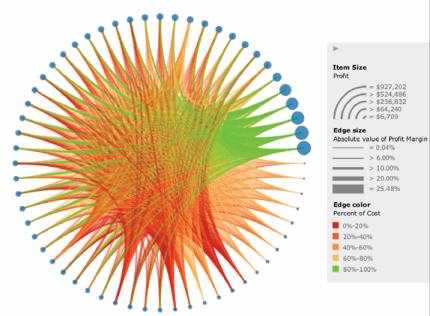
you can add a Network visualization to the dashboard to quickly and easily
identify relationships between related items and clusters, such as when
visualizing a social network or displaying a market basket analysis. Attribute
elements are displayed as nodes in the visualization, with lines (called
edges) drawn between the nodes to represent relationships between elements.
Once the visualization is created, users can view characteristics of the
nodes and the relationships between them, using display options such as
node size, edge thickness, and edge color. For example, if a node is displayed
for each store in a country, users can display a connection between two
nodes using a thicker line if the two stores share a large number of customers.

Prerequisites
- You
must have the Web Edit Dashboard and Web Run Dashboard privileges.
- You
must have already created the dashboard to add the visualization to.
Steps to create
and add a Network visualization to a dashboard
- Click the name of the dashboard
to run it.
- From the toolbar, click the Insert Visualization icon
 . A new blank visualization is
added to the dashboard and displayed.
- From the Visualization Gallery,
click the Network icon.
- If the Datasets panel is not displayed,
from the View menu, select
Datasets Panel.
- From the Datasets
panel, click and drag attributes to the appropriate area in the Network panel, as follows:
Note: Edges will be drawn from
attribute elements that belong to the From Item area to related attribute
elements that belong to the To Item area. Attribute elements will
be considered related to each other if they are included in the same
data row when the data in the visualization is displayed as a grid.
- Drag
an attribute to the From Item area. Each element
of this attribute will be displayed as a node in the visualization.
- Drag
an attribute to the To Item
area. Each element of this attribute will be displayed as a node
in the visualization.
- To select
the metric that determines the thickness of each edge, drag the
metric to the Edge Size
area. Edges for larger metric values are displayed as thicker
than edges for small metric values.
- To select
the metric to use to color edges, drag the metric to the Edge Color area. Each edge in
the visualization is automatically colored based on the value
of this metric.
- To select
the metric that determines the size of each node, drag a metric
to the Item Size area.
Nodes for larger metric values are displayed as larger than nodes
for small metric values.
Note: You can also drag objects from the Datasets panel directly
onto the visualization.
- For each attribute in the Editor
panel, you can select which attribute forms are displayed in the visualization.
An attribute form is a descriptive category for an attribute.
To select the attribute forms, in the Editor panel, right-click the
attribute and point to Display Attribute
Form. Select one of the following:
- To display
an attribute form in the visualization, select the check box next
to its name.
- To hide
an attribute form in the visualization, clear the check box next
to its name.
- Click the Save
icon
 to save your changes.
 Copyright Numerify, Inc. All Rights Reserved ©2021


 Copyright Numerify, Inc. All Rights Reserved ©2021