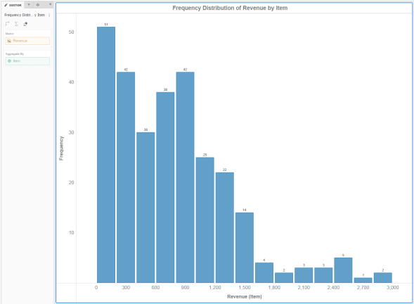
A histogram visualization allows you to examine the underlying frequency distribution of a set of continuous data. Metric values are grouped into ranges (that is, bins). Each range is represented by a bar in the visualization. A histogram must include only one metric and at least one attribute.
Related Topics
Selecting data in a Histogram or Waterfall Chart
Zooming and panning on a Histogram, Waterfall Chart, or Box Plot
 Copyright Numerify, Inc. All Rights Reserved ©2021