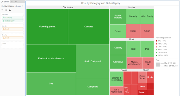
You can quickly grasp the state and impact of a large number of variables at one time by displaying your data with a heat map visualization. A heat map visualization is a combination of nested, colored rectangles, each representing an attribute element. Heat Maps are often used in the financial services industry to review the status of a portfolio.
The rectangles contain a wide variety and many shadings of colors, which emphasize the weight of the various components. In a heat map visualization:
Related Topics
Creating Heat Map visualizations
Formatting a Heat Map visualization
 Copyright Numerify, Inc. All Rights Reserved ©2021